
Editor's note: There are many good books worth reading in the field of data science, especially a series of animal-covered English books published by O'Reilly. One of the "lizard books" is called "Python Data Science Handbook" (Python Data Science Handbook). The book details the specific usage of Jupyter, Numpy, Pandas, data visualization and scikit-learn modules. It is a beginner's guide to machine learning. a shortcut. Recently, Jake VanderPlas, the author of this book, wrote a blog post that introduced an interesting concept in simple terms: the waiting time paradox.
Image source: Wikipedia License: CC-BY-SA 3.0
Anyone who uses public transportation a lot may have encountered this situation:
You wait for the bus at the bus stop, and the sign shows that the bus departs every 10 minutes. You glance at your watch and note the time... 11 minutes later, the bus finally arrives, and you can't help but start to feel annoyed: why am I so unlucky all the time!
It is known that the bus departs every 10 minutes, and you arrive at the platform at a random time (without the help of a real-time bus APP). Faced with this situation, many people will take it for granted that their average waiting time should be 5 minute. But in fact, after 5 minutes, the bus did not come, then you can only continue to wait; after 10 minutes, the bus may still not come... Under some reasonable mathematical assumptions, you can draw an amazing conclusion:
When the average bus departure interval is 10 minutes, the average passenger waiting time for the bus will also be 10 minutes.
This is the waiting time paradox.
So is this paradox real? Are these "reasonable assumptions" merely theoretical, or are they equally applicable to reality? This article will take the real bus arrival time data in Seattle, USA as an example, to discuss this problem from the perspective of simulation and probabilistic argument.
Inspection Paradox
If there must be a train to this platform every 10 minutes, then our average wait time is indeed half that interval: 5 minutes. But if 10 minutes is an average, it's understandable that the average passenger wait time is actually longer than 5 minutes.
The waiting time paradox is actually a special case of the test paradox, which is more common in everyday life. As a simple example, suppose you are investigating the class size of a university. The survey method is to randomly select some students and ask "how many students are in your class" and then calculate the average. In the end, the result of your statistics is an average of 56 students. However, the school-wide average class size is actually only 36 (the data above comes from a Purdue University survey). This is not to say that someone has lied, but that the probability of being sampled is different for a class of 10 and a class of 100. Random sampling will lead to over-sampling of the larger class, skewing the results to the larger party.
In the same way, when there is a bus arriving at the platform every 10 minutes on average, sometimes the arrival interval between the two buses will exceed 10 minutes, and sometimes it will be less than 10 minutes. If you arrive at the platform at a random time, you will There is a greater chance of encountering more than 10 minutes. So it makes sense that the average wait time for passengers is longer because longer intervals are oversampled.
But the waiting time paradox brings up an even more “unbelievable†conclusion: when the average arrival interval of the front and rear two buses is N minutes, the average bus arrival interval experienced by passengers is 2N minutes. Will this be true?
Simulation waiting time
To justify the conclusion of the waiting time paradox, first we can simulate some buses whose average arrival time is 10 minutes. It is known that the larger the sample size, the more accurate the result. We set a total of 1 million buses. :
import numpy as np
N = 1000000# number of buses
tau = 10# average arrival interval
rand = np.random.RandomState(42) # random seed
bus_arrival_times = N * tau * np.sort(rand.rand(N))
Next, let's check that their average inter-arrival interval is close to Ï„=10:
intervals = np.diff(bus_arrival_times)
intervals.mean()
Output: 9.9999879601518398
After simulating the bus, simulate a large number of passengers arriving at the bus stop within this time span and calculate the waiting time for each of them. As shown below, we encapsulate it in a function for later use:
def simulate_wait_times(arrival_times,
rseed=8675309, # Jenny's random seed
n_passengers=1000000):
rand = np.random.RandomState(rseed)
arrival_times = np.asarray(arrival_times)
passenger_times = arrival_times.max() * rand.rand(n_passengers)
# Find the next bus for each simulated passenger
i = np.searchsorted(arrival_times, passenger_times, side='right')
return arrival_times[i] - passenger_times
Then we can simulate some wait times and calculate the average:
wait_times = simulate_wait_times(bus_arrival_times)
wait_times.mean()
Output: 10.001584206227317
The average wait time for passengers is also closer to 10 minutes, as predicted by the Waiting Time Paradox.
Digging Deeper: Probability and Poisson Processes
So what exactly does the above code mean?
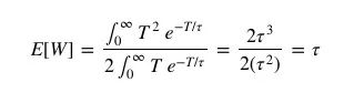
Essentially, the latency paradox is a special case of the testing paradox, where the probability of observing a value is related to the value itself. Let us denote the distribution of the bus arrival time interval T by p(T). At this time, the expected value of the arrival time is:
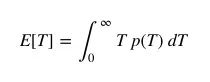
In the above example, we have set E[T]=Ï„=10 minutes.
When passengers arrive at a bus stop at a random point in time, the probability of the waiting time they experience is affected by both p(T) and T itself: the longer the inter-arrival interval between cars, the probability that passengers experience a longer waiting time will increase accordingly.
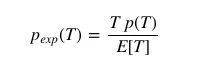
So we can write the distribution of car arrival intervals as perceived by passengers:
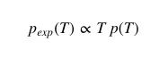
Their proportionality constants are:

That is:
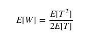
Knowing that the passenger's expected waiting time E[W] is half the bus-arrival interval they experience, we can write it as:
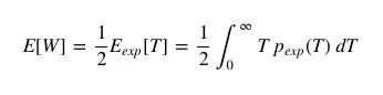
Rewrite the above formula to get:
All that's left now is to choose a list for p(T), and compute the integral.
choose p(T)
We can simulate the distribution of p(T) by plotting a histogram of bus-to-stop intervals:
%matplotlib inline
import matplotlib.pyplot as plt
plt.style.use('seaborn')
plt.hist(intervals, bins=np.arange(80), density=True)
plt.axvline(intervals.mean(), color='black', linestyle='dotted')
plt.xlabel('Interval between arrivals (minutes)')
plt.ylabel('Probability density');
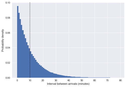
The dotted line in the figure indicates that the average arrival time is 10 minutes. It can be found that the shape of the distribution in the above figure is very similar to the exponential distribution, which is not accidental: our approach of simulating the bus arrival interval into a uniform random number is very similar to the Poisson process, and if a Poisson process is formed, the distribution of the arrival interval is certain. conforms to an exponential distribution.
Note: In our example, the arrival interval distribution is only approximately exponential.
If the arrival interval follows an exponential distribution, it follows a Poisson process - to test this reasoning, we can check with another property of the Poisson process: the distribution of bus arrivals over a fixed time horizon satisfies Poisson distributed. We can look at the number of bus arrivals per hour in the previous simulation:
from scipy.stats import poisson
# Calculate the number of bus arrivals in 1 hour
binsize = 60
binned_arrivals = np.bincount((bus_arrival_times // binsize).astype(int))
x = np.arange(20)
# draw the result
plt.hist(binned_arrivals, bins=x - 0.5, density=True, alpha=0.5, label='simulation')
plt.plot(x, poisson(binsize / tau).pmf(x), 'ok', label='Poisson prediction')
plt.xlabel('Number of arrivals per hour')
plt.ylabel('frequency')
plt.legend();
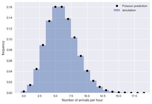
As shown in the figure above, the simulation order distribution (square bars) and Poisson distribution (black dots) are almost identical. Now the theory and simulation practice support the fact that for a sufficiently large N, the bus arrival interval can be described by a Poisson process, and the arrival interval distribution satisfies the exponential distribution.
This means that we can write the probability distribution as:
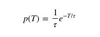
Putting the above equation into the previous equation, the average waiting time per passenger is:
Therefore, the average expected waiting time of a passenger is the same as the average arrival interval of a bus if the bus's arrival interval follows a Poisson process.
Another complementary way to infer this conclusion is that a Poisson process is a memoryless process, which means that a historical event has nothing to do with the expected time of the next event. So when you arrive at a bus stop, your average wait time for the next bus is always the same: you have to wait an average of 10 minutes regardless of when the previous bus came. In the same way, the expected wait time for the next bus is 10 minutes, no matter how long you have waited before.
real wait time
So can a Poisson process describe the bus arrival time in real life?
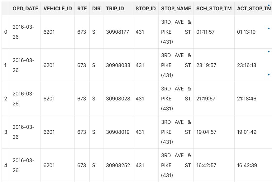
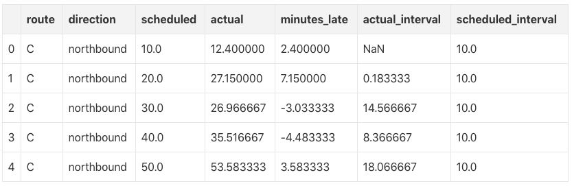
To explore whether the waiting time paradox is contradicting the reality, we can dig deeper with some data (arrival_times.csv, 3MB CSV file). This dataset contains the records of the 3rd & Pike bus station in Seattle, USA in the second quarter of 2016. It has a total of 3 express lines: C, D and E, giving the scheduled and actual arrival time of each bus.
import pandas as pd
df = pd.read_csv('arrival_times.csv')
df = df.dropna(axis=0, how='any')
df.head()
The express line was chosen because the inter-arrival interval of these buses is stable between 10-15 minutes for most of the day.
data cleaning
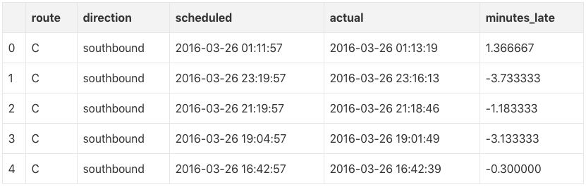
First, let's do some simple data cleaning to convert the tables in the dataset into a more usable form:
# Combine date and time into a single timestamp
df['scheduled'] = pd.to_datetime(df['OPD_DATE'] + ' ' + df['SCH_STOP_TM'])
df['actual'] = pd.to_datetime(df['OPD_DATE'] + ' ' + df['ACT_STOP_TM'])
# If the expected and actual arrival of the bus is past midnight, the date needs to be adjusted
minute = np.timedelta64(1, 'm')
hour = 60 * minute
diff_hrs = (df['actual'] - df['scheduled']) / hour
df.loc[diff_hrs > 20, 'actual'] -= 24 * hour
df.loc[diff_hrs
df['minutes_late'] = (df['actual'] - df['scheduled']) / minute
# Internal and external path mapping
df['route'] = df['RTE'].replace({673: 'C', 674: 'D', 675: 'E'}).astype('category')
df['direction'] = df['DIR'].replace({'N': 'northbound', 'S': 'southbound'}).astype('category')
# Fetch useful columns
df = df[['route', 'direction', 'scheduled', 'actual', 'minutes_late']].copy()
df.head()
bus delay
There are 6 different sets of data in the dataset: Southbound and Northbound 3 buses. To get a feel for their early/late characteristics, we can use the actual arrival time minus the expected arrival time to draw 6 graphs of the "late" bus situation:
import seaborn as sns
g = sns.FacetGrid(df, row="direction", col="route")
g.map(plt.hist, "minutes_late", bins=np.arange(-10, 20))
g.set_titles('{col_name} {row_name}')
g.set_axis_labels('minutes late', 'number of buses');
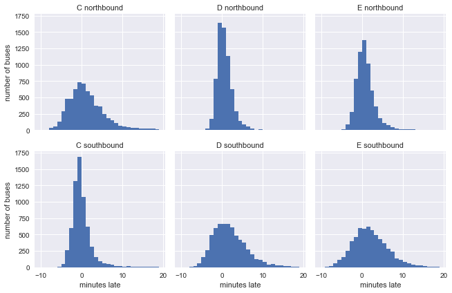
In fact, many people know from experience that it is more difficult for the bus to be delayed for a period of time immediately after the departure. This is confirmed in the picture above. The southbound C bus (picture 4), the northbound D bus (picture 2) and the northbound E bus are still on time when they first leave , but in the end it was more than ten minutes late.
Expected and actual arrivals
Next, let's take a look at the actual arrival intervals of these 6 lines, which can be calculated using Pandas' groupby function:
def compute_headway(scheduled):
minute = np.timedelta64(1, 'm')
return scheduled.sort_values().diff() / minute
grouped = df.groupby(['route', 'direction'])
df['actual_interval'] = grouped['actual'].transform(compute_headway)
df['scheduled_interval'] = grouped['scheduled'].transform(compute_headway)
g = sns.FacetGrid(df.dropna(), row="direction", col="route")
g.map(plt.hist, "actual_interval", bins=np.arange(50) + 0.5)
g.set_titles('{col_name} {row_name}')
g.set_axis_labels('actual interval (minutes)', 'number of buses');
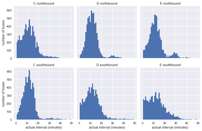
Obviously, there is a big gap between the above distribution and the exponential distribution, but it has a potential influence factor, that is, the expected arrival interval, which affects the actual arrival interval, may itself not be constant.
So we have to look again at the expected arrival interval:
g = sns.FacetGrid(df.dropna(), row="direction", col="route")
g.map(plt.hist, "scheduled_interval", bins=np.arange(20) - 0.5)
g.set_titles('{col_name} {row_name}')
g.set_axis_labels('scheduled interval (minutes)', 'frequency');
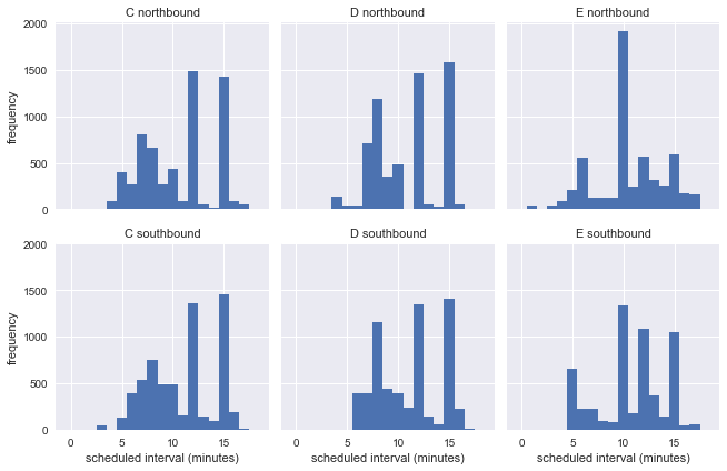
Obviously, the expected arrival interval is not a fixed value, and it can vary widely. So in this dataset, we cannot use the distribution of actual arrival intervals to assess whether the latency paradox is accurate.
Build the same schedule
Although the expected arrival intervals are not uniform, there are some common specific intervals among them, such as the expected interval of 10 minutes for nearly 2000 northbound E-road vehicles in the dataset. To explore whether the waiting time paradox is true, we can classify the data set by bus route, travel direction, and expected stop-to-stop interval, filter out similar data and re-stack the analysis, assuming that they are continuous departures.
def stack_sequence(data):
# first, sort by scheduled time
data = data.sort_values('scheduled')
# re-stack data & recompute relevant quantities
data['scheduled'] = data['scheduled_interval'].cumsum()
data['actual'] = data['scheduled'] + data['minutes_late']
data['actual_interval'] = data['actual'].sort_values().diff()
return data
subset = df[df.scheduled_interval.isin([10, 12, 15])]
grouped = subset.groupby(['route', 'direction', 'scheduled_interval'])
sequenced = grouped.apply(stack_sequence).reset_index(drop=True)
sequenced.head()
Using this cleaned data, we can plot the "actual" bus arrival interval distribution for each bus route, direction of travel, and frequency of arrivals:
for route in ['C', 'D', 'E']:
g = sns.FacetGrid(sequenced.query(f"route == '{route}'"),
row="direction", col="scheduled_interval")
g.map(plt.hist, "actual_interval", bins=np.arange(40) + 0.5)
g.set_titles('{row_name} ({col_name:.0f} min)')
g.set_axis_labels('actual interval (min)', 'count')
g.fig.set_size_inches(8, 4)
g.fig.suptitle(f'{route} line', y=1.05, fontsize=14)

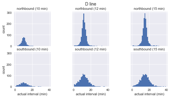
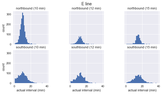
As shown in the figure above, the distribution of the arrival intervals of these three buses approximates a Gaussian distribution: it reaches a peak near the expected arrival interval, and the standard deviation is small at the beginning and becomes larger as it goes on. So obviously, this goes against the cornerstone of the waiting time paradox, the exponential distribution.
We then use the above data to calculate the average waiting time of passengers for each bus route, direction of travel and frequency of arrivals:
grouped = sequenced.groupby(['route', 'direction', 'scheduled_interval'])
sims = grouped['actual'].apply(simulate_wait_times)
output:
route direction scheduled_interval
C northbound 10.0 7.8 +/- 12.5
12.0 7.4 +/- 5.7
15.0 8.8 +/- 6.4
southbound 10.0 6.2 +/- 6.3
12.0 6.8 +/- 5.2
15.0 8.4 +/- 7.3
D northbound 10.0 6.1 +/- 7.1
12.0 6.5 +/- 4.6
15.0 7.9 +/- 5.3
southbound 10.0 6.7 +/- 5.3
12.0 7.5 +/- 5.9
15.0 8.8 +/- 6.5
E northbound 10.0 5.5 +/- 3.7
12.0 6.5 +/- 4.3
15.0 7.9 +/- 4.9
southbound 10.0 6.8 +/- 5.6
12.0 7.3 +/- 5.2
15.0 8.7 +/- 6.0
Name: actual, dtype: object
Average wait times may be a minute or two longer than half the expected stop-to-stop interval, but not as the wait-time paradox would suggest. In other words, this result confirms the testing paradox, and the waiting time paradox does not seem to match reality.
final thoughts
The waiting time paradox has always been an interesting topic covering simulations, comparisons of probabilistic and statistical assumptions with reality. While we have now confirmed that real-world bus routes do follow some of the test paradoxes, the above analysis also makes it very clear that the core assumption behind the waiting time paradox - that bus-to-stop intervals follow a Poisson process is very problematic.
In retrospect, this may not be surprising: a Poisson process is a memoryless process that assumes that the bus arrival probability is completely independent of the time since the last arrival. But in reality, a well-functioning bus system will have a reasonable schedule, and the departure times of each bus are not random, they have to take into account the number of passengers.
And the bigger lesson that emerges from this question is that we should be careful with assumptions about any data analysis task. While Poisson processes are sometimes a good description of arrival time data, just because one type of data looks a lot like another, we cannot take it for granted that the assumptions that are valid for this type of data are necessarily Works equally well for the other. Seemingly correct assumptions can lead to conclusions that do not match reality.
Plastic Tube Pressure Gauge,Plastic Pressure Gauge,Plastic Tube Manometer,Plastic Pipe Pressure Gauge
ZHOUSHAN JIAERLING METER CO.,LTD , https://www.zsjrlmeter.com